Peribreakpoints: breakpoints near breakpoints
Have you considered having more breakpoints than you have breakpoints?
Let me explain.
When people say “breakpoint”, they’re usually referring to one of two definitions:
- breakpoint₁
- A viewport width that has a
@media (max-width: …)or@media (min-width: …)somewhere in a site’s CSS. - breakpoint₂
- A viewport width at which you rejigger your site’s layout so it looks good, if different, at widths wider than this width and at widths narrower than this width.
These two definitions aren’t quite the same.
In particular, you might benefit from having a couple of @media (min-width: …) blocks in your site’s CSS that you don’t think of as a proper breakpoint. I call these peribreakpoints.
Peribreakpoints: why they’re useful
You’re used to using breakpoints to rejigger your site’s layout when the current design doesn’t work well below — or above — a range of viewport widths. You’ve seen — or perhaps made — layouts like this:
<body>
  <div class="everything">
    <div class="spotlight">
      <div class="spotlight__image"></div>
      <div class="spotlight__verbiage">…</div>
    </div>
  </div>
</body>
that are styled with this:
* {
  margin: 0;
  padding: 0;
}

.everything {
  /* any wider and line lengths
   * get too long to read
   */
  max-width: 40rem;
  margin: 0 auto;
}

.spotlight {
  /* has text on one side and an
   * image on the other */

  /* … */
}
This looks fine when the viewport is noticeably wider than 40rem, but at viewport widths of 40rem and below, normal text will be flush against the viewport edge. In general, we don’t want this. The obvious fix is to add a breakpoint at 40em and, below this width, have some extra space:
@media (max-width: 40em) {
  .everything .spotlight {
    margin: 0 0.5rem;
  }
}
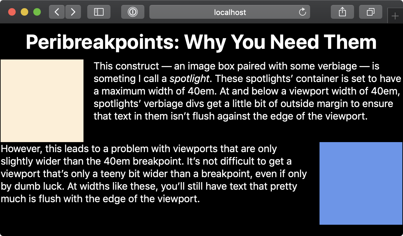
But what if the viewport width is just a little bit wider than 40em? It still looks bad:

This looks like the author forgot to put margins around the text that’s flush against the edge of the viewport.
You can also view this “before” example live and play around with your window’s width yourself.
The solution, then, is to make up a peribreakpoint — a breakpoint near a more important breakpoint.
Applying peribreakpoints
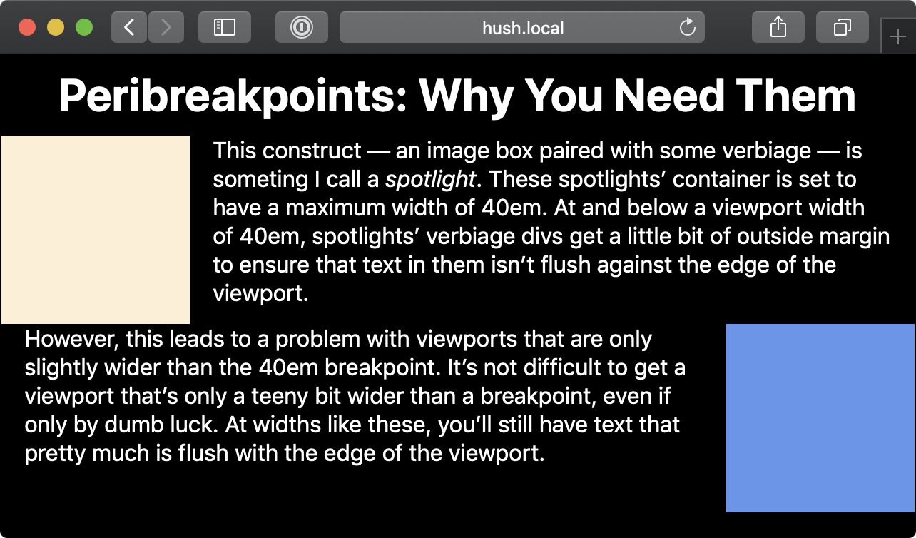
This is as simple as it sounds. Make up a new breakpoint that’s close to the more-important 40em breakpoint. Since we want the text to be pinched in no matter whether the viewport width is 40.1em or 39.9em, let’s set the max-width peribreakpoint at 41em:
@media (max-width: 41em) {
  .everything .spotlight {
    margin: 0 0.5rem;
  }
}
This is what it looks like afterwards.

Relative peribreakpoints in CSS preprocessors
All that said, what should you call these peribreakpoints? Quite honestly, I don’t have great advice, at least not yet. Here’s what I did in less a few weeks back:
@maximum-defined-width: 100ch;
@narrower-than-maximum: ~'(max-width: @{maximum-defined-width})';

@side-spacing: 10ch;
@maximum-defined-width-plus-spacing: @maximum-defined-width + @side-spacing;
@narrower-than-maximum-plus-spacing: ~'(max-width: @{maximum-defined-width-plus-spacing})';

// …

.spotlight__verbiage--on-left {
  @media @narrower-than-maximum-plus-spacing {
    padding-left: 1rem;
  }
}
These are long names (the last definition is 92 columns if I don’t break it manually), but at least the media queries’ names are obvious.